
Kad-Sis Rebrand
Brand
İstanbul Altın Rafinerisi
Industry
Investment
Services
Rebranding
Perception
Feeling & Perception
01 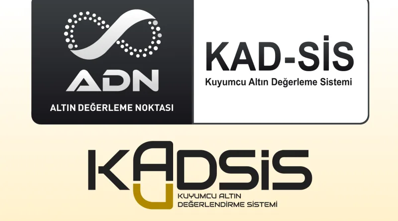
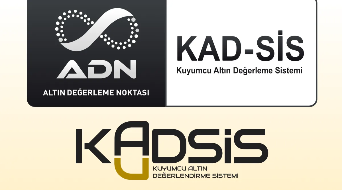
Instrumental Look to a Brand Look
The rebranding shifts the identity from a purely instrumental, function-focused appearance into a more complete and recognizable brand presence. By refining the visual language, tone, and digital expression, the system becomes easier to trust, easier to understand, and more aligned with the professional standards of the financial services it supports.
02 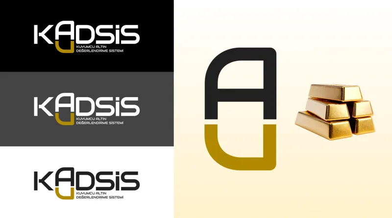
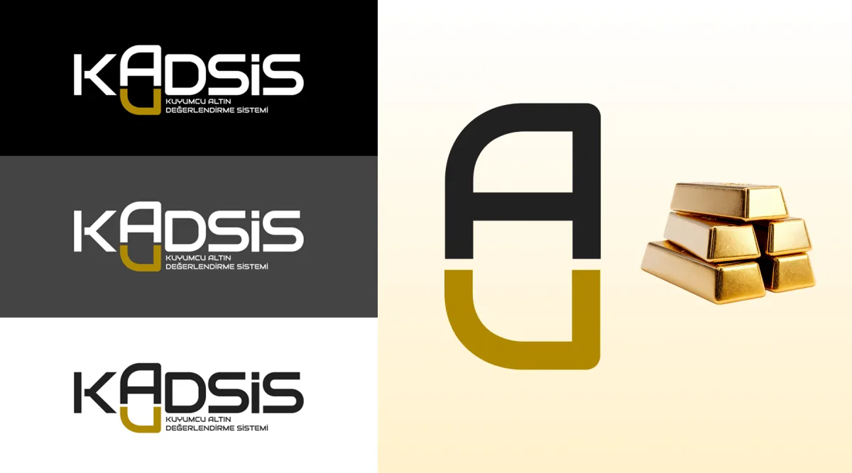
Resembling a Gold Bar, Chemically Au
The rebranding builds a stronger visual identity by drawing inspiration from the form of a gold bar and the chemical symbol “Au,” creating a direct yet refined connection to value, trust, and precious metals. This approach transforms the brand into a more distinctive and memorable presence, while keeping its financial and gold-focused purpose clear at first glance.
Transformation
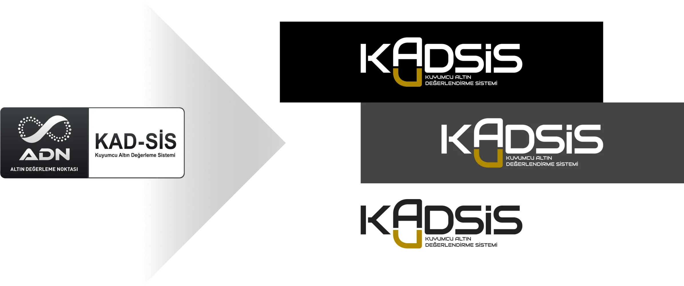
The "Before & After"
Current & Used 
Proposed & Unused